
Project 1: Essay
Studio photography means photographing a shoot in an indoor studio environment where you are in control of everything from the lighting to the the background and so on. There are a number of different genres within studio photography which include advertising, fashion, portraiture and still life.
As studio photography was well introduced before proper studio photography lighting, some of the earliest photography studios were inspired by painters lighting techniques. This is because, most painters and artists studios would have a large upwards facing sky light, which would make the most of reflected or indirect light. As the sun wouldn’t directly shine through all day long, it mean the lighting was diffused and would be soft which is easier to work with. Studio photography became more common around the year 1840 as this was due to the invention of Daguerreotype created by Louis-Jacques-Mande Daguerre, which was one of the first methods of being able to take a photograph. A Daguerrotype is a process which uses a sheet of silver plated copper to create a positive or negative image.
Fashion photography is a style of photography devoted to displaying fashion garments and other fashion accessories, however as well as this portraiture is a very big aspect of it. This genre of photography is generally used for fashion magazines or advertisement, which is why you’ll see that these images are normally shot inside of a studio environment.  This is because these images are trying to promote the clothing or item so it’s important to have the best quality lighting to produce a strong image. Despite fashion photography being a genre in it’s own right, it includes a lot of portraiture within it, so the two genres share a strong link. This is seen a lot within magazines, for example Vogue and Elle are well known fashion magazines but almost always on the front cover will be a portrait shot inside a studio environment which can be consider both fashion photography and portraiture. There is always a lot of studio photography included in magazines, more so than location because normally in magazines, photography is there to capture people being interviewed or to display clothing so it’s easier to do this in a studio where you can be in control of everything. However, studio’s have progressed and developed over the years and weren’t always set up as they are seen today. Edward Steichen (1879-1973) was one of the earliest fashion photographers and is considered the founding father of modern fashion photography as he attempted the idea to display fashion through the art of photography.
  He created his own lighting and studio techniques that had never been seen before so for years other photographers had no other option but to follow in his footsteps. Steichen would frequently use the gum-bichromate printing process that worked depending on light sensitivity of salts called dichromates. His photos for the magazine Art et Decoration of gowns were regarded the first modern fashion photographs ever published. It is evident comparing Steichen’s image to the vogue cover just how much photography, let alone fashion photography, has developed and improved over the years and the difference between digital photography and the processes that were used in the 19th century. As well as this, the two images also show how the definition of fashion photography has changed because portraiture is a large part of it now and portraits on their own are considered fashion photography and are two very similar genres that work together.
However, a genre that is different to this is still life photography whi
Project 2: Advertising
Advertising matters. Hundreds of billions of pounds are spent each year in the attempt to promote the sale of merchandise. Often the more creative the approach, the more successful the advert is in achieving this function. As well as playing an important part in popular culture, successful images are increasingly recognised as an art form all of their own.
Jack Daniels: Jonathan Knowles and Bomper Studios collaboration
Lots of corporate brands, in particular alcohol and perfume use studio photography to show off bottles and capture them in immense detail. One brand who’s studio work stands out to me are the advertisement images for Jack Daniel’s. In particular their Christmas campaign shot by award winning photographer Jonathan Knowles collaborating with Bomper studios. Their task was to create festive fairy lights using CGI, that would wrap around the bottles. Knowles photographed the bottles at his London studio and used the raw unedited photos as a template so that they could create the CGI lights to wrap around the bottles. Bomper recreated Knowles’ studio setup in C4D (computer 4 design) including a professional lighting setup that would be used for high-end product photography. By building the lights using CGI, it meant that Knowles had more control over his image than we would have with traditional photography, as he was able to control the shadows from the wire on the bottle and the reflections of the bulbs on the glass etc.


These images show screen grabs from the website showing the final outcome of their advertisement. It’s interesting how they have presented it as they have showed the final outcome as well as what the setup looked like when creating the CGI lights and you can switch between the two by dragging the line across as it shows in my screen grabs. I haven’t ever seen an advert like this and I think it’s a unique way to show how they have created it. An advert like this would be aimed for an older target audience as obviously Jack Daniels is alcohol and can only be bought by over 18’s. However it’s normally people older that drink whiskey which is why the advert is more simplistic than it would be if the target audience was younger. The lights have definitely added what would have been a missing touch to the image as the bottles were shot against a white background which is still effective but quite bland, so the colours of the lights have really improved the image.
Matthew Seed


Matthew Seed is a British advertising and fashion photographer who has been in the industry for over twenty five years and in this time he has been considered one of the most skilled professional photographers and technical light experts in the country. He has won commissions with both UK and international brands and has maintained strong work relationships with a number of global brands and advertising agencies. Some of the brands that he has worked with include JD Sports, Lacoste, Silver Cross Prams, Selfridges, Reebok, Foot Asylum and even the BBC. His passion for photography and his impressive technical lighting setup produce high standard results which is why he has loyal clients who return to his studio. Matthew delivers photography and lighting master classes for colleges, universities and clients across the UK.


These show some examples of Seed’s studio advertisement photography which would be more realistic for me to recreate than some of his more complex images. The first image shows and advertisement for Boo Tea which is a weight loss product that is normally promoted on instagram by bloggers and celebrities etc. It is normally promoted by women as opposed to men so it’s target audience would be women/young girls. The advert has been shot against a white background and has quite minimal colour in it, there’s a lot of green colours as the product is meant to be consumed for health purposes. I also liked how he has stacked the pots on top of each other in quite a messy way which makes the advert feel more relaxed. The next image shows an advert for The Gentry Grooming Co which is a male grooming brand. This product being photographed is a face wash and Seed has decided to photograph it against a black background and has placed the product on a mirror so that you can see the reflection clearly. By placing mirror underneath the product it creates the illusion that the product is bigger and makes the photo less dull as there is something else to look at amongst the black setting. The image below is very similar in the way that he has decided to photograph the product, this shows a Mont Blanc hair product. Although the product is black, I wouldn’t have thought that a black background would be suitable because I thought the product wouldn’t stand out but from looking at Seed’s photography I’m quite inspired to use a black background because it looks easy to work with and produces very professional studio images.
Shoot Plan
After researching different advertisements and the photographers, I have decided my theme for this project will be photographing different smellies, by this I mean products such as body wash, deodorant, perfume, lotion etc. This is because there are so many different ways to present pleasantly smelling products, this can be done by colour, props, lighting and so on.
For my first shoot, I am going to be taking inspiration from the advertisement photographer, Matthew Seed and will be photographing a body lotion and deodorant set against a black background.
- I have decided to do this as some of the images I included in my research of Seed really stand out to me and I think are really strong adverts that would appeal to its audience. In particular, the images of the body wash and hair product that he shot against a black background. Even though the products themselves are dark, you would have thought they would look better against a brighter, more contrasting background, however the black on black makes the photo darker and more intriguing in my opinion.
- I will place the products on top of a mirror so that you can see the reflection thus making them look bigger than they are and that there is more than what there is.
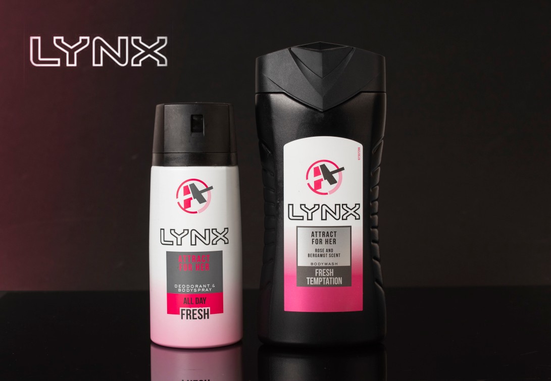
- I think I will probably choose something like a Lynx set to photograph because their adverts are normally quite dark which matches the intense and strong smell of the product.
- I won’t use any extra props for these images as I want the products to stand alone against the dark background.
Examples of Lynx adverts:


Shoot 1:


For this shoot, I decided to photograph a women’s Lynx deodorant and body wash set. After looking at Seed’s images of a face wash for The Gentry Grooming Co, I was inspired to photograph something similar to that product against a dark background. Also, what stood out to me from his images was the reflection of the product as he had used a mirror so I also took inspiration from that and placed a mirror underneath the products that I photographed. Despite not having as big of shoot as I would normally have, when taking the images I could see that they were strong so I felt as though I didn’t need to capture as many. The images that were shot landscape rather than portrait are my personal favourites because they look as though it would be something that you would see advertised on a billboard.
Best images from shoot:


Final Image:
This was my most successful image from my first shoot for advertisement photography, out of all of my images, I think this particular one and how it has been edited looks the most professional and realistic. Initially when shooting these images, I thought that I would have preffered the portrait images of the bottles as opposed to the landscape but I found this image to be very strong and I like how there is a lot of black background because it helps the products stand out. To edit the raw file, I lowered the temperature so the photo wasn’t so warm and slightly increased the tint to make the pink a bit stronger, I also highly increased the contrast and slightly upped the exposure and blacks. I then opened the image into photoshop where I was able to add the logo and the pink fade. To add the logo, I found it on google images where I saved it, then opened it in photoshop and dragged it over the image and as it had a box around it, I used the spot healing brush to make it blend in the background. I thought that the image was missing something so I was also able to add the pink colour fade by adjusting the gradient layer and selecting this pink colour.
Rob Grimm
Rob Grimm is an American commercial photographer who also goes by the name of RGG on social media sites. He specialises more towards images of food and drink, in particular different alcohol brands. His intentions with his work are too create impressive images that attract peoples attention and to dazzle them. Brands that he has worked with include Skyy Vodka, Grey Goose, Cabo Wabo Tequila, Budweiser, Bombay Sapphire, Yogurtland, Kraft Foods and so on.


Although Grimm photographs advertising imagery for both food and drink, not many of his food images were shot inside a studio which is why I am more interested in his images of beverages. The bottom image of the San Pelligrino drink stands out to me because from looking at it, Grimm would have had to have taken multiple images and using photoshop merge them together to create the effect that the oranges are floating. I think this looks really effective what he has done in this image as well as the Budweiser bottle image is getting the bottles wet where you can see the droplets in great detail which influences the audience into purchasing the beverages. I also like how Grimm uses lighter, more colourful backgrounds for the products as opposed to Matthew Seed who generally worked with darker backgrounds. Lighter backgrounds can look quite refreshing and add a missing touch of colour to an image.
Shoot Plan
For my next shoot, I am going to be photographing a fruity and colourful body wash taking into consideration Grimm’s style of how he shoots his products.
- My first shoot was of a Lynx deodorant set which was more of an intense and harsh scent hence the dark tones of the image, however I think I am going to photograph a strawberry or mango scented body wash, a product that would have colour in it. This is because I think there’s a lot you can do with colour, such as including different props and being able to use a range of different colours alongside it.
- The reason why I am inspired by Grimm is because of his use of cool tones alongside warm tones that he uses in some of his images which creates a really interesting effect. Also, the angles that he uses make the product look longer which is a technique that I could consider.
- I am going to include fruit next to the product as well, for example if I do decided to photograph a strawberry body wash, I will place strawberries next to the bottle in a way that works with the product.
- I will experiment with different background colours and see which one works best for the colour of the product.
Shoot 2:


This was my second shoot for advertising studio photography, for this shoot I decided to capture images for a body wash advertisement. I decided to pick this particular product because I feel like there’s a lot of different ways that you can present items such as soap and shower gel depending on their different scents and names. For example, what I decided to photograph was a raspberry ripple body wash and as the shower gel is in such a vibrant pink bottle, I thought another strong vibrant colour would work well alongside it. The warm tones from the pink and cool tones from the blue really contrast against each other, making the pink seem more dominant and is the first thing that catches your eye. I also decided to add props such as raspberries to go with the theme which I think complimented the bottle very well. As well as that, I decided to drizzle some of the product in a line and took some photos with and without raspberries on top of it. However, I think the reflection of the the bottle in the drizzle of product is quite distracting which is why I prefer the images with the bottle standing on its own or with the fruit alongside it.


Final images:

This is my best image from the raspberry shower gel shoot that I captured because I feel it is the strongest of them all and the composition of the fruit against the bottle works really well. However, this image did require a lot of editing before it got to this state, I started by edited the raw file using a lower temperature and then slightly increasing the tint and vibrance to make to colours in the image look more warm. As well as this, I highly increased the contrast to give more definition to the image. In the original image, there were marks on the bottle from where the light was reflecting which was really distracting, so by using the clone stamp tool, I selected colour from a part of the bottle which would match the area and it covered it up. I also used the spot healing brush tool which takes the colour from its surroundings and covers the area you want on the lid as you could see small hairs and such that show up very visibly in studio lighting. I cropped the image so it was more square shaped as I didn’t want too much background to be on show which would be distracting from the product.
Project 3: Portraiture
Studio portrait photography is the art of capturing a message about a person’s character in a single moment. The reason studio portraits are created vary. Sentimental family portraits might show the sitters at a happy time, a business portrait may depict the authority of the sitter, a musician would want to sell an album, fashion imagery should sell a theme of the clothing being worn and an actor would need a powerful headshot.
For this project, I want to shoot portraits that would be in a high end fashion magazine. I want to have a theme running throughout my shoot of using different prints such as leopard, zebra etc and have four final images of four different models wearing a different print. I want to use black and white backgrounds to make the models wearing the prints stand out more because I feel like colour would be too distracting. I’m going to use two female and two male models because I want to use people that look entirely different but are linked together by the items of clothing.
Mario Testino


Mario Testino OBE, is a very famous Peruvian fashion and portrait photographer born 30 October 1954. Over the years he has had international features in magazines such as Vogue, V Magazine, Vanity Fair and GQ. Testino went to London to study photography in 1976 where he made his first attempts of becoming a photographer, as he felt he could express himself and his work more freely than in Peru. His career lifted off with a commission to photograph a girl haircut for British Vogue, the girl he used was the stylist Lucinda Chambers which created a friendship and partnership still strong to this day. Testino’s work pushes the boundaries and explores gender, mixes masculinity and femininity and demonstrates ‘sensuality rather than sexuality’.
Personally, I find Testino’s work highly inspiring because it’s memorable and he is like no other artist. Testino shows that studio portraits don’t have to be boring black and white headshots, by experimenting with colour and makeup and props and using models who aren’t the conventional deception of how society see’s beauty. He was worked with so many big names such as Kate Moss, Naomi Campbell, The Rolling Stone and even the Royal family. Testing really inspires me to step outside of the box when it comes to portraits because he breaks the stigma that used to be in my head which was studio portraits look all the same against a white background because if you really experiment with clothing makeup and even how you position the models you can create some amazing shoots.

I find this image of the model Cara Delevigne for Allure magazine in 2014 very fascinating and really sticks in my mind. The image shows the model dripping in foundation whilst still looking absolutely flawless. The way that I interpret this image is that Testino is trying to bite back and people that criticise girls for wearing too much makeup and instead he shows how makeup is art and makes it look pure. This image unique and is very memorable which Testino has a talent for. Also, I think the background is really effective and adds a slight tint of colour that the image needed, I feel like this image against a white background would look too washed out because of the colour of the makeup. This really inspires me to be as experimental as possible with my portraits and to really explore with makeup and consider what makes images have their own individuality.
 Another image that stood out to me from one of Testino’s Hollywood portrait collection was this image of Brad Pitt. It’s quite simple in the sense that he hasn’t got eccentric makeup on the model or they’re not in the nude but I like it because it shows how even his more simple portraits are still interesting to look at. I also like how he has made a fade from his face and hand, against the red background it looks really effective. Another aspect of this image that stands out to me is how the model is positioned, it reminds me of the film that Pitt was in ‘Snatch’ where he was a gypsy boxer and how in reality he is the antithesis of this as he shows off his expensive watch and clothing this image. This inspires me to experiment with different colour backgrounds because even though white is always classic and is easy to work with, sometimes colour really changes the image and makes it better.
Shoot 1:
Plan:


These are my first images from the portraiture project, I wanted to capture fashion imagery, something that you would see in a magazine. I used two models for this shoot because that was the only time that they would be able to come in which worked to my advantage because as well as being able to shoot them individually, I was able to capture ones of them together which I hadn’t initially planned to do. Originally, I planned to use a white background because I wanted the models to be the main focus in colour, however when I went into the studio the purple background was already up and when the models stood next to it I found it really complimented them, especially Bethany as the purple really contrasted her vibrant orange hair. The models and I brought in a selection of different clothing for them to model in, my theme for this project is to try and capture different prints so I brought a leopard print coat and a check coat. However, in some of the images a black Balenciaga coat was being modelled which didn’t have a print on it but it had bold writing on the back which was really eye-catching so I wanted to include it in the shoot.
Best Images from Shoot 1:


These are a selection of my best images from my first studio portrait shoot. The first few images are my absolute favourite from the shoot. I love the first image because I think the leopard print coat with the models vibrant orange hair against the purple background all work hand in hand together. I also think the beret adds to the image and the black contrasts with the colour in the image. I do also really like the black and white images of the girl in the check puffer coat and the hat, however my only criticism about them is the background as turning purple black and doesn’t work very well. Another image that I think is strong is the one with the model wearing the black coat with Balenciaga written on the back of it. I wanted the writing to be visible hence the positioning of the model, I also like how oversized the coat is and how it doesn’t really fit her properly because that is the sort of fashion that would be seen in a magazine.
I think the models posing and positioning is what make the images look effective, however I think I should have used a different background and considered where I was standing as at times I was too close to the lighting and it would show too much unwanted detail on the background. I think if I were to do this shoot again, I would use a white background as I had originally planned to because I feel like I would be able to produce stronger edits.
Lighting diagram from my shoot:

This diagram shows the lighting set up in the studio from my shoot. I used three lights one on the right and two on the left to really brighten up the studio and to try and make the purple background look as vibrant as possible which I succeeded at. However, at times the background looked really bad and too much detail was shown up in it but this was my fault as I was stood too close to the lights so now I know not to do this for next time. This is the normal set up that I would use in the studio, I also normally use one of the boxes to sit the models on as well which I didn’t include in the diagram.
Alex Sainsbury


Alex Sainsbury is a portrait and a fashion photography who is based in London. He’s known for his up close and personal portrait work as well as his quirky fashion images. He has done a lot of work with brands including Diesel, Topshop, JW Anderson and Jonathan Saunders and also shoots regularly for Dazed, Garage and Wonderland. He has worked with some big names such as Michael Jackson, Lindsey Lohan, Slaves and Matty Healy. He works with a lot of black and white tones which always looks really effective and gives the impression that he has a more mature style when shooting studio images.
I am inspired by Sainsbury because I feel like his photos are quite simple yet effective, he shows that you don’t need to shoot at a location or have ridiculous props to capture portraiture images, instead a plain white or even coloured background can compliment the model just as well. I also like how his models are comfortable with him shooting them when they look revealing, for example the topless shoot with Slaves, it shows confidence from the models as well as the photographer, I find those images very inspiring and I would like to create something similar, perhaps even a pastiche. What I also like about Alex Sainsbury’s work is the intensity of the models poses in his images, in every single one of these images that I have included not one model is smiling which adds to the professionalism of his studio portraiture.
Shoot 2:


This was my second studio portrait shoot for this project and I am very pleased with how the images turned out compared to my last shoot. This time, I stuck to my ideas and mind map more as I decided to use a white background which was what I was originally going to use for my first shoot. The white looks a lot better than the purple background that I used before because the white was very crisp and was easy to edit over whereas in my other shoot, if I made a photo black and white it didn’t really work because the background was too dark. I had asked the models to bring a selection of different clothes with them so there was more of a variety of photos, I asked them to bring brightly coloured or pattered clothes in particular as my original idea for these images was to have a four final images showing models wearing patterned clothes. However, I think I am going to use that concept for a different project as I think the images where the model has his top off are really effective as they look very inspired by Alex Sainsbury’s shoot that he did with Slaves. I also think the photos of the boys together work really well as they’re outfits work well together and as they are friends and know each other they don’t look awkward in the photos. I was fortunate enough to have very confident models and I think it shows through the images which I am very pleased with because it makes the photos seem more professional.
Best images from shoot:


Diptych:


This image is in my opinion my strongest and best image from my studio shoot. I feel like it’s very obvious that my images have been inspired by Alex Sainsbury, in particular this image shares the same style as the photos of Laurie Vincent and Isaac Holman from the band slaves. What I like about this photo is even though it is similar to Sainsbury’s work, the models tattoo helps give the image it’s own individuality and really catches your eyes. Also, through editing I managed to get the whites and blacks the right tone that I wanted, I managed to get a crisp enough white that it blends in with the background. On some of my image I struggled to get the whites light enough and the look slightly discoloured but I think it works in some of the photos. I preferred the black and white images to the colour because they were easier to edit and produced stronger edits in my opinion.
David Bailey


Shoot Plan
For my next shoot for portraiture, I want to shoot a female model on her own, as my past two shoots have been images with multiple models, I want to focus and work with just one.
- I will take inspiration from all of the artists that I have researched, in particular David Bailey as I admire his black and white work and close up portraits.
- Like my previous shoot, I will use a white or maybe grey background as they are easier to edit and work well in black and white.
- I almost want to recreate a modern day version of Bailey’s portraits, using modern clothing, accessories, makeup etc.
Shoot 2:


