
Activity 1: Album Artwork
My favourite album covers


")


Cover artwork on albums helps sends the message about the artist and the contents of the album. The artwork can either make or break the album itself so it is very important that the artwork sends the correct message. As well as this, the choice of wording on the album cover is important and the way that its displayed. My favourite album covers are ones that are slightly abstract but I also like quite simple ones with just an image of the artist because I think that can be quite effective too and makes it easier to recognise the artist.
Storm Thorgerson
Storm Thorgerson (born 28 February 1944 – 18 April 2013) was a British graphic designer and music video director. He is best known for creating the artwork for album covers for rock artists such as Pink Floyd, Led Zeppelin, Biffy Clyro, ACDC and Muse. He studied film and television at the Royal College of Art where he graduated with a Master of Arts degree. Along with Aubrey Powell, in 1968 he founded the graphic art group Hipgnosis and between them they designed numerous famous single and album covers. Thorgerson had a limited edition book and box set titled ‘Taken by Storm: The Album of Art’ priced at £500 a copy. Thorgerson and Powell also made some of their original artwork available to art collectors for the first time, selling a selection of best pieces through Heritage Auctions Galleries. He was a teenage friend of Pink Floyd guitarist David Gilmour, where he would later go on the design Pink Floyd’s ‘Dark Side of the Moon’ cover.


Thorgerson’s style is very abstract and surreal, a common theme within some of his covers are capturing a landscapes and having enlarging the object in it. His most successful album cover is probably the ‘Dark Side of the Moon’ by Pink Floyd as it’s an iconic and easily recognisable album. He includes bright and vibrant colours in his work which makes it stand out and this is something that I would incorporate within my own work because I want to create a bright and bold album cover. One of my personal favourite album covers of his is the bottom right AC/DC ‘Dirty Deeds Done Dirt Cheap’, this is because I like how theres a group of random people with their eyes covered for no apparent reason, I think it looks really effective. Also, in the Muse ‘Black Holes & Revelations’ cover, I like how there is a group of men in the middle of no where casually sat at a table minding their own business as if there’s nothing wrong and are oblivious to the fact that they are on another planet. For my album cover I think that I will definitely include rather the artist or a group of people because I think that album covers are more eye catching when there are people in it and theres many things to look at such as their clothes, expressions etc.
Jeff Koons
Jeff Koons, born January 21 1955, is an American artist from York, Pennsylvania who lives and works there as well as New York. He is known for working with popular culture subjects and for his reproductions of basic objects such as balloon animals produced in stainless steel. He gained recognition in the 1980’s and set up a factory-like studio in New York where he had 30 assistants each assigned to a different aspect of producing his work, in a similar style to Andy Warhol’s factory. He attended the Maryland Institute College of Art in Baltimore, while earning his master of fine arts there, he attended a show at the Whitney Museum in New York, that changed his life. Koons says “I remember being an art student and going to the Whitney to see the exhibition of Jim Nutt, the Chicago imagist” it was from then he decided to transfer to school in Chicago all because of that show. Jim Nutt has a very colourful and wacky style so it’s evident to see the influence that he has had on him. Koons’ first show was in 1980 and he emerged onto the scene with a style that was of mix of pop, conceptual, craft and appropriation to create his own unique style. His work includes subjects such as sex, race, gender and fame and he brings them to life in forms such as balloons, bronzed sporting items and inflatable toys.

This is Lady Gaga’s album ‘Artpop’ which was designed by Jeff Koons. The cover shows Gaga in the form of a sculpture with a gazing blue ball against her, a prop which Koons uses with his work. Also in the background there are cut up biblical images which contradict how Lady Gaga is being portrayed. I think the font works well because you cant fully see her name but because of her fame people already know who it is without having to read it all which I think is effective. I think the bright pink writing stands out behind the sculpture of GaGa and brightens up the image and stops it from looking dull. What I like about this album cover is that there is a collage of images which form to make the background, with the man centre of attention photographed over it. There’s a lot going on in the image which makes it interesting to look at and stays in your mind. This album would probably be suited for an age group around 18-30 as its chart music that is generally played in clubs etc, from looking at the album cover it’s evident that it probably isn’t suitable for young children. I’m very much inspired by this album cover and when it comes to taking my own images i want to try and include layering because I like how messy and chaotic it looks and how there is more than just one focus.


These are other examples of Jeff Koons’ work, it’s clear to see how his previous pieces of art influenced the album cover. The image on the far left shows a surreal image with random facial parts cut up and layered on top of one another, which is similar to the background on the album cover. The middle image shows one of Koons’ balloon animal sculptures made from stainless steel in an exhibition. On the far right is a mold of a classical sculpture with a blue gazing ball on top of it which also features on the album cover.
Font research

On album covers, the font is important because it gives an indication of what the album is going to be about. It is important that the font can be seen big and clearly and are readable so the title and name are obvious because those are the most important things on an album. Sans serif fonts are a good one to use because they are big and striking, even in colour they are still readable because they are bold. On some of the album covers that I have researched, they use what looks like san serif fonts, even if they are small on the cover they are still visible and can be read. I think I will use the font ‘Lemon Milk’ for my album cover because I like how it’s strong and bold and stands out. Depending on the image on the album cover itself, I could use this font in colour or just black and white because it is bold and easy to read.
 However, this is an example of fonts that aren’t as suitable for an album cover. These fonts are found under the category ‘curly’ and show thin, swirly writing. Compared to sans serif fonts these would be more difficult to read as they are quite distracting and on top of an image, they wouldn’t look very strong. Particularly if they were in colour, they would be very difficult to read. I think that curly writing like this would be more suitable for a younger audience because it looks quite soft however for the album cover that I want to create, I don’t want it to be for children so this isn’t a font that I would use.
Idea Generation
Shoot 1:
I haven’t decided what album it is that I want to recreate yet, I think I will take the images first and then decided what artist and what album suits the images best.
For my first shoot, I want to take photos of models looking posed like how they do in my artists that I have looked at albums, I want them to look like they are supposed to be there rather than a candid shot.
However I will take my photos outside in a natural setting, I don’t want to take it in a studio because I don’t want it to look too professional as it doesn’t fit with the music or artist that I have chosen.
From looking at the artists that I have chosen, I like the font and the colour of it on Lady Gaga’s album, I also like how messy and chaotic it is. From looking at Thorgerson’s albums, I’m inspired by his sense of surrealism and the random placement of objects. I could use random props in my images like Thorgerson.


I don’t think my first shoot was as successful as I would have liked it to be. I think this was because I was taking images but I couldn’t really envision what I wanted my album to look like. I think that I am better off using one model if any next time because it just looks pointless with two and they’re outfits clash with each other.
Shoot 2:
Even though I have looked at two artists, I have decide that I am going to recreate the single ‘Sheila’ by the singer Jamie T. This is because even though I am inspired by the albums that I have researched, what I want to photograph doesn’t match the artists on the albums that I have looked at. The reason I want to do Jamie T is that his music genre is indie and with that kind of music I feel that it is easy to photograph things that represent that genre.
For my next shoot, I’m going to take images of only one of the models so that the focus is on that one model alone. I think I will do it in the same location against a brick wall, but this time when it’s dark so that I can use the flash on my camera to take bright and bold images.
As well as this, I want to take some photos in the city of buildings and landscapes and see if they would work well as an album cover. On one of Jamie T’s albums, he has a fisheye image with buildings in the back so that kind of style image would suit his music.


This was my second shoot for my album covers, I am very pleased with how this shoot turned out compared to my other shoot. I did two small shoots on the same day and combined them together. The first shoot was taken when I was in Bristol on my way home when I came across these buildings and scaffolding which I thought I could capture some interesting images of. The other half of the shoot was inspired by my first shoot, I used the same model as I had previously in my other shoot but just made the photos more personal and simple.
My best edits:
These are my three best images that I have taken overall. These were all taken after my first shoot because I wasn’t happy with how that shoot went it inspired me to take two better shoots in which my best images came from.
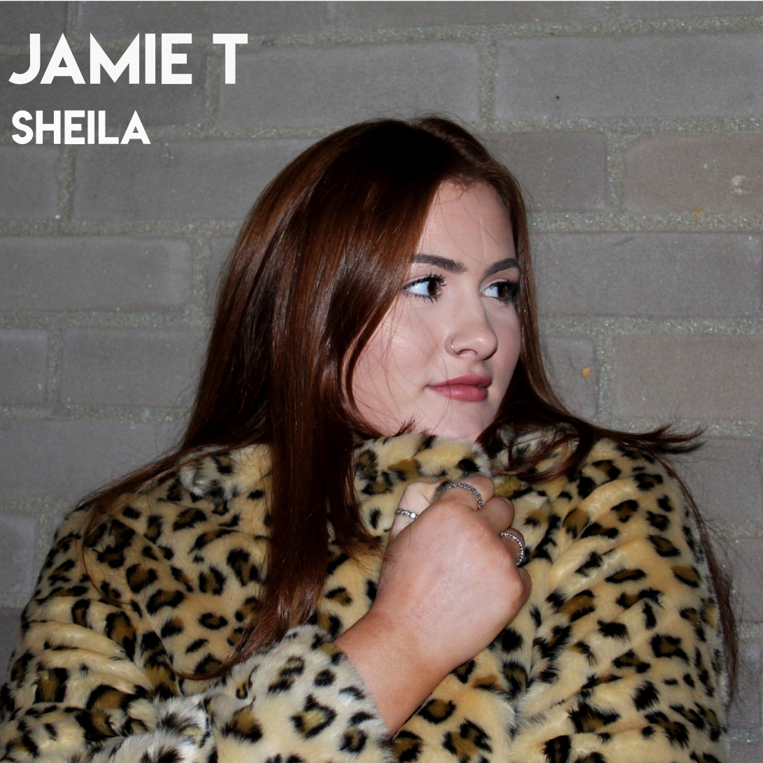
The first photo shows a model against a brick wall, this was taken with my first shoot still in mind as I used the same location. I used a model, in particular, a girl to relate to the title of the album ‘Sheila’. I asked the model to wear a leopard print coat because it’s eye-catching and stands out against the mundane background. That image was inspired by my previous shoot but instead what I changed about it was that I chose to take more personal, up-close images and I shot it at night and used flash which made the image look more powerful. The reason I didn’t use this edit was that as my ideas developed I decided that my photos without using models look better.
The next image is the one that I chose to print off and use as my final image. It shows a tall hotel building in Bristol, I decided to photograph it because to me it looked old and dirty and rough which fits with the theme of the artist. I decided to keep it black and white because the original image didn’t contain very much colour so I wanted to make it black and white and make the dark and light tones in the image strong. As I chose to keep it in black and white, I decided that I wanted to use bright and bold text to make the artists name stand out strong. I opted for a bright pink colour which I think works well as it really contrasts with the black and white image. What I also like about this image is that I haven’t included the whole of the building and the roof is on a slight slant which can suggest that there’s more to be revealed.
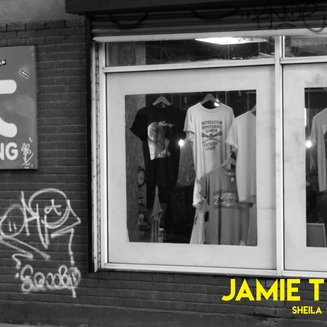
My other successful edit shows part of a shop window with clothes hanging up and graffiti on the wall next to it. This shop was in the same place as the hotel which I photographed in my other edit. This again was because the artist can be known to be quite fashionable and edgy so this image works quite well to represent his style. I also did this in black and white just because in my opinion the edit looked stronger without colour and I did the same thing again where I used a bright coloured font. I chose to use a yellow font because it’s quite different and eye-catching. The reason I didn’t use this for my final edit was that both this image and the one of the building are quite similar but visually I think the one of the building works better because it’s simple yet effective.
My final image

Overall, I am happy with the outcome of my work and think I have created a successful album cover. The reason why I decided to go with that image and not the others was that I felt like it looks like more of an album cover than the others as it’s simple yet effective and the bright colour of the text against the black and white background is really eye-catching. The only one criticism I have about it was that the text was too close to the edge of the image so when I printed it off part of the letter T was cut off. So next time that is something to consider when using text that it is not too close to the edge. Also, from my first shoot I think it is evident how my ideas have changed and developed and improved to end up with my final image.
Activity 2: Photographic Narrative – 8 Page Zine
The Photographic narrative is a genre of photography which tells a story, it consists of a sequence of photos that need to be viewed in an order for a story to develop. The images are constructed as the photographer plans and stages the images with thought.
Duane Michals
Duane Michals is an American photographer from Pennsylvania born 18 February 1932. He is best known for his work in the constructed narrative genre. His interest in art came from a young age and he studied at the Parsons School of Design with plans to be a graphic designer, however, did not complete his course. Michals work became more recognised in the 1960’s, which was an era involving photojournalism which Michals would adapt to create narratives. Michals works with a frame by frame format and often uses text in his work. Michals’ work has been exhibited in the United States as well as other places abroad. His work has even been displayed in the Museum of Modern Art in New York in 1970. Some of his work can be considered surreal as his subject matters can be very abstract, he includes Lewis Caroll and Rene Magritte as his influences.

This narrative series of photos by Michals is called ‘The Dream of Flowers’, it shows a man over four photos with his head led on some sort of reflective surface surrounded by flowers. In each photo, there are more and more flowers surrounding his head which represent how he’s dreaming of flowers and how the dream is progressing so he envisions more flowers. I think this is a very simple yet impactful narrative, the story behind the photos is quite obvious which makes it satisfying to look at. I like the difference between the flowers and the man because flowers have connotations of being delicate and are deemed quite feminine and they contrast against the model who has connotations of being more harsh. I also like how it is in black and white because colour can be distracting and as the flowers in the photo change and move around each time I think that would be more distracting as the focus would be on the colour rather than the story. Floral images are normally in colour so I like how this is in black and white and focus more on the shape and arrangement of the flowers rather than the colour. I am very much inspired by this image and think for my narrative images they are going to be inspired by dreams and show how a dream develops.
 I also really like this series of images by Michals, which shows the eventual death of a bunch of flowers. It has many of the same elements as the previous photo but tells a different story completely which I find fascinating, because even though both series of photos are similar, to me they tell a completely different story. The first images show the flowers when they would have first bloomed and gradually they become smaller and shriveled up and less beautiful. Also, whether Michals has done this intentionally or not, it almost looks as if the man is getting older as well, from looking at him in the first photo his hair has been cut out so as the images progress it looks like his hair is growing and the light shows more of his wrinkles. Also in the first image, he is looking at the flowers head on and gradually his head gets lower as the flowers die which show how he is sympathising with them perhaps. I could take an image like this if I bought something like flowers or food and shot them over time and show how they eventually die. What I think is interesting about this is that it only took four photos to show the flowers dying, it only took four images to tell that story which I think is effective.
David J Carol
David Jeffrey Carol, born August 23 1958, is a photographer, co-founder of Peanut Press Books and author of a number of photography books. He was born and raised in New York where he attended the School of Visual Arts where he studied under Lisette Model. He was one of the first photographers for The Image Bank photo agency which is now part of Getty Images. He is the author of four monographs, such as ‘NO PLAN B’ which is a collection of his humorous and surreal personal work. The book contains images from his road trips from the Arctic Ocean to Russia to Istanbul. It consists of 32 black and white photographs which tell the story of Carol’s adventures.

This image by Carol is part of his street photography collection, it shows a person walking around the streets of New York with a round object placed on their head with the words printed on it ‘Who Cares’. I like this image and it stands out to me because Carol has just photographed a simple street photo but just by placing that object on that person’s head makes it stand out and different from others. This message can be interpreted in many different ways, perhaps the person doesn’t care what people think and wants to walk around addressing that or maybe they are trying to get peoples attention as they think that nobody cares about them.

I like this photo by Carol and I think it’s a very creative, well thought out image. It shows a landscape with a mountain in the middle of it and someone’s hand holding open a book with the photo of that scene in it. I think this tells a story because perhaps the person was reading that book and saw that photo and decided to go there and see it for themselves, or maybe they conveniently opened a page on the book of the place where they were standing. I like how there are two different perspectives of the same scene, one through the book and one in real life looking at it. I feel like I could recreate an image like this if I were to take a photo of a landscape and print it out and go to that same place an hold up the image. I think it tells a story because that place must hold some significance to the photographer otherwise they wouldn’t have gone out of their way to visit that place from the book.
Idea Generation
For this project, I have several ideas that I could use for my story inspired by the photographers that I have researched.
Idea 1: Dreams
My first idea is inspired by Duane Michals ‘The Dream of Flowers’ image, which is four images of a man asleep and in each photo more and more flowers surround him showing that he’s dreaming of them. I like this idea because it’s quite simple it shows us what he’s dreaming about and thinking.
I could take inspiration from this by using a model and I could photograph what they are dreaming of over 8 images. Instead of doing a dreamlike Michals, I could photograph a nightmare. This is because I feel like it’s easier to show a nightmare develop and tell a story rather than a positive and happy dream. I could photograph all of the model’s fears and have them surrounding the model.
Idea 2: Death
Another idea is inspired by Michals other image of the man staring at the flowers and over a course of four images you gradually see them die. I could photograph something like flowers or fruit something that can die and go off quite quickly and show the process of how it eventually dies.
I would start by photographing something when it’s new and fresh and then over the course of a few days, photograph it each day and show how they change. I would have to take these photos over a matter of days/weeks to show the full process. I could ask a model to hold the flowers and show as they die that they become more and more sad so the mood of the story becomes more morbid and depressing. I could display a happy scene at the start and then something happens to make the model depressed and as they become sadder the flowers die and reflect the mood.
Idea 3: Bullying
The last idea I had was to show a story about bullying. This was partially inspired by Carol’s image of the person wearing the object on his head with the words ‘who cares’. That inspired me to consider telling a story of someone who feels like no one cares about them as they are being bullied.
For this, I would use only one model to show how they feel isolated and alone and I think I will probably demonstrate the bullying through social media to make it more relatable to people today. I could show how social media has a big impact on peoples lives and can dictate how others view them and decide to treat them.


This was my shoot for this project, I decided to carry out my idea of bullying. I stuck to my plan of showing bullying through social media which I photographed over a few images. I went with this idea because I thought it was the most obvious theme to identify in a zine rather than dreams because I struggled to come up with ideas of how to actually photograph that. I didn’t take as many photos as I normally do for a shoot because I felt like I captured what I needed to and all the images are quite self-explanatory. I decided to do this shoot in a bedroom because it shows how you don’t even have to leave your house to have people harassing you, it can happen in the safe environment of someone’s own house. If I were to redo this shoot, however, I think I could consider things like lighting a bit more carefully because I didn’t really put much thought into it and if I were to of shot this in a studio the lighting would have been much better, but I wanted the environment to be someones home so it fit my idea better.
Final images for zine:


These are my images that I am going to use to create my zine, I have more than 8 but I thought on some I could use two per page as some of the images are quite similar. The basic story that I have created is that the girl feels alone and isolated, so to reassure herself and make her feel better she uploads a photo of herself on social media. However, when she does this, it stirs up a lot of abuse as bullies turn to social media to write nasty comments about her and spam her with hate. The girl then falls into a hysterical state and see’s all of these words appear on her face showing what she now thinks about herself.
Layout:

This is the layout of my zine which I created in Photoshop using an A3 template. I had to rotate images and writing so that when I printed it off and folded it nothing was upside down. It took a few attempts to get the layout of it right because when I printed it off, the words were bigger than they look in Photoshop and some were hanging off the edge, and some of the photos were uneven and not straight and were showing unnecessary bits of white that I didn’t want to be shown. So this was the final perfect layout of my zine which I then went on to print.
My final zine:

This was my final, finished and folded zine. I am happy with the outcome as I think I have created a successful narrative that’s easy to follow. I chose to tell a story of cyberbullying because I think it’s relevant and can be easily told over only a few photos. For the text on my zine, I decided to insert a poem that I found online about cyberbullying, it was a short poem which I typed in quite a childish text to show how such a horrible thing can happen to someone so young. I also decided to keep it black and white because it fits with the dark and negative theme of the story. One thing that I could have improved about my zine is perhaps the colour of the font, because I wanted to keep it black and white, its quite hard too see the text. However, when I experimented with other font colours it looked to distracting and ruined the photos which I want to keep the main focus.
Creating the zine itself took quite a few attempts to try and fold it correctly and ensure things like the writing isn’t going off the page on Photoshop. After three attempts of printing and folding it out, I was finally happy with my zine. However one criticism that I do have is that it wasn’t folded absolutely perfect so some of the edges are a bit uneven, but other than that I am happy with how my zine turned out.
